Introduction

This is my current project and is a work in progress. New sections will be added as the project moves forward through the steps from understanding the challenges, to completed code.

While pursuing the Google UX Certification (via Coursera.com) I was tasked with designing a responsive landing page with a random prompt (via Sharpen.com). The third prompt I saw really sang to me:

Design a bands' new album landing page as a responsive web site.

As a life-long music nerd and musician, I felt this was the perfect way to build something that, hopefully, could be expounded upon later into a full band site with all the bells and whistles. This New Album Landing Page project case study, as detailed below, has been a fascinating challenge and I have learned so much from the process. From learning about the views of music fans and promoters to tinkering with layouts to make the interaction more delightful every step has been educational as much as it has been fun. Please see the sections below for each major step in the process for this project and feel free to click the links for more detailed information.

Thank you for your time and kind attention.


Empathize

New Album Initial Survey

Initial User Survey

Started with a short survey that included seven participants: Five music fans, and two music promoters. Due to the limited project scope for the project, I decided it was best to focus specifically on the prompt (“New Album Landing Page”) rather than a full-fledged band web site. This allowed me to focus on the primary audience and intention before moving onto secondary user types or flows. The survey went very smoothly, responses helped illuminate that “listen”, “purchase”, and “tour dates” were the primary motivations for users. The results also informed certain aspects of how users relate to a band both visually and aurally. How users'preferences and tastes align with the band sound, aesthetic, and overall style has a huge impact on user behavior. Read the full survey notes here.

Results Map

By arranging the survey results by theme, I was able to more easily visualize how to prioritize the results which informed our personas, problem statements, and goal priorities. Survey responses were clear in the users' priorities: Listen, purchase, and tour dates, respectively. Users clearly wanted to listen to a sample before making a purchase or ticket decision. It was also of note that users wanted all three of these information groups to be available on the album landing page without having to click off to another site for more information. Responses were color coded by respondent and organized thematically via Jamboard. Check out the final map on Jamboard

User Personas

From the survey findings I developed two user personas to help focus design goals. I divide users into two groups: fans and promoters. Fans are represented by Hercule Charly who loves to listen to new, exciting music and may purchase digital or physical versions of albums to add to his collection. Promoters are represented by Joyce Parker who wants to hear smaller samples of more songs from a band and get a bit of background information before determining viability for a live show booking. Both users prioritize “listen” over “purchase” but also want to easily find other relevant information quickly. See full profiles here.

Define

User Need Statement - Hercule

Hercule is a/an older music collector who needs easy to navigate and accessible album information because confusing web sites are frustrating.

User Need Statement - Joyce

Joyce is a busy music professional who needs up to date and accurate information about an album and the band because she has no time to hunt down that information.

Competitive Analysis

Once there was a more clear picture of what our users are after, I performed an audit of 12 new releases and chose 5 landing pages from that group for deeper analysis. These were specifically chosen from a variety of music genres and band popularity to help me understand a wide-spectrum of approaches. Overall the pages informed about the new album they were promoting and offered some level of listening engagement and information. It was interesting that there were a variety of approaches to listening and many pages choose to send users away to an outside service (e.g. Spotify, Apple Music, etc) rather than directly on the landing page. Other issues were in forcing users away from the page to purchase and the lack of tour dates and bio information. By unifying all of this information on a single page load, I feel that users will be more likely to listen and, ideally, to buy. For more detail: Analysis Spreadsheet & Notes.

Ideate

How Might We?

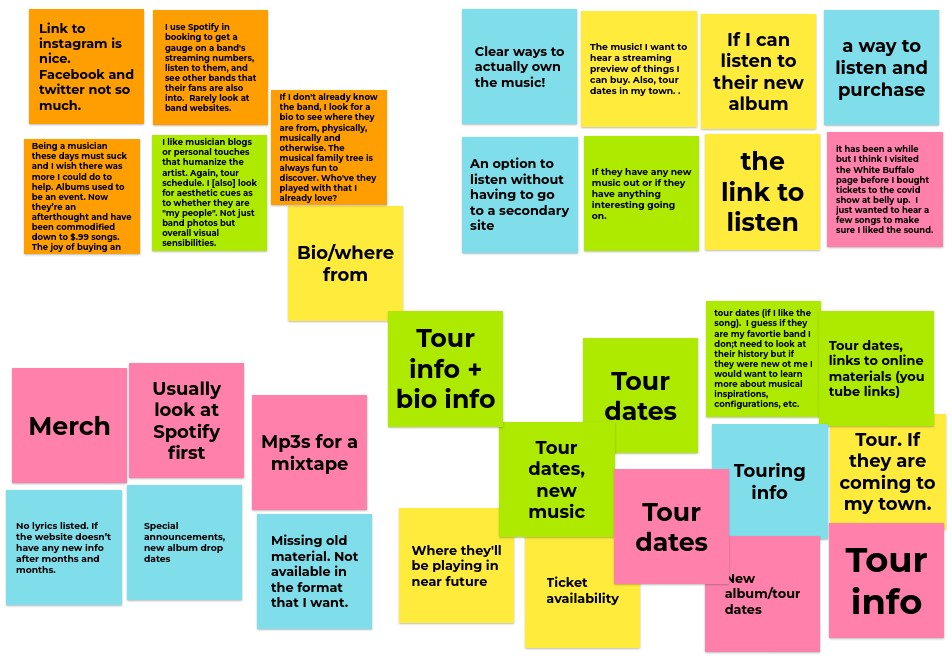
Once there was a more clear understanding of what users want, where their pain points are, and how current bands present their solutions I felt it was time for some introspection on the two big themes of the design with How Might We statements:

How Might We ensure that the music is easy to listen to on the album landing page? This is the primary item we need to address.

How Might We ensure that the purchasing flow of the music in a variety of formats is clear and simple. Our secondary item of focus is pretty straightforward by mentioned here for clarity.

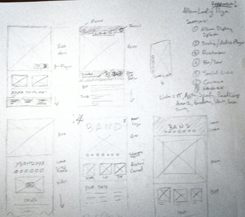
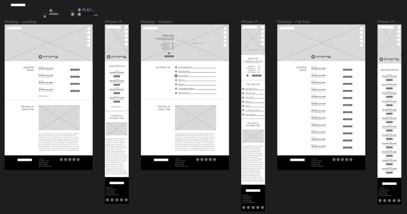
Information Architecture (IA)

Being a simple landing page, IA is unfussy and straightforward featuring:

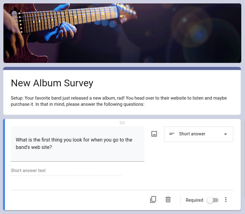
A Listen Function that allows users to hear samples (or full song tracks) simply, displays the song title, and allows for play, pause, and next track functions. Note: Must place agency on the users and DO NOT auto-play.

About the Album Information content to be determined by marketing needs.

Purchase Option(s) that allow users to buy in a variety of formats suited to their needs like vinyl or download.

Upcoming Tour Dates with a link to the full tour schedule.

Social & Outbound Links for users who prefer specific platforms.

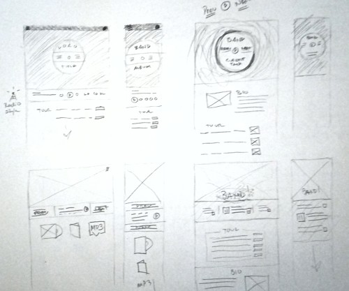
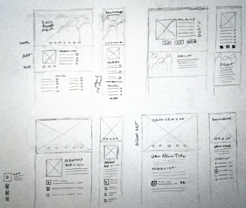
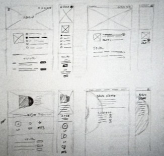
Low Fidelity Wireframe Sketches

Numerous sketch sessions produced a number of options both in the meta design and in the individual components. Each UI element was iterated upon with pencil and paper first before committing. Ultimately, due to the nature of the ficticious band I had chosen to use (ambiant electronica) the choice to simplify as much as possible became a driving force. Clean, clear, and straightforward UX.

Follow me to the Figma Wireframes.


Prototype


Final Thoughts